Ryvoka
← FolioCase · 004

Plumbing service & repair

Dravix Plumbing

A calm, conversion-first plumbing site with same-week booking front and center.

Wide screenshot of a minimal plumbing homepage with a calm bathroom image
Fig. 01Homepage: single-image hero, two-word headline, one CTA.

The brief

Dravix needed a plumbing site that looked like the company they wanted to be, calm, precise, premium, not the cluttered emergency-themed sites their competitors ran. The brief: a quiet hero, a same-week booking promise, and a single visible CTA on every screen.

What we did

  • / 01Brand-led hero with a same-week booking promise
  • / 02Single primary CTA, Book a free consultation, pinned across the site
  • / 03Service pages structured around repair, install, and maintenance
  • / 04Reviews and FAQ as quiet trust scaffolding, not decoration
  • / 05Fast, mobile-first build with 95+ Lighthouse

Results · A short tabulation

Metric · 01

48h

Average appointment window

Metric · 02

10d

Brief to launched site

Metric · 03

97/100

Lighthouse mobile

Chapter · 01

A plumbing site that doesn't shout

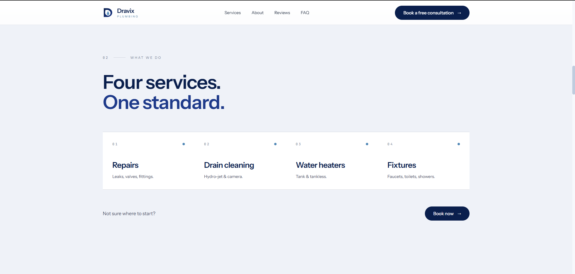
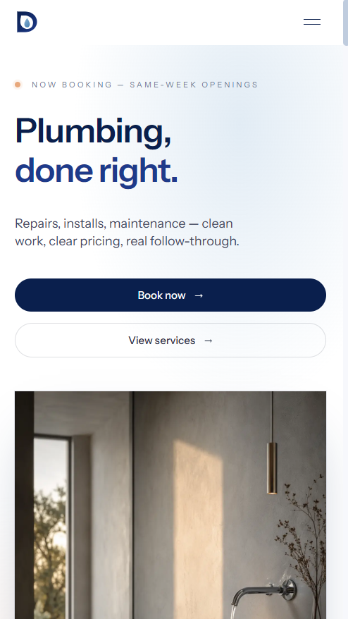
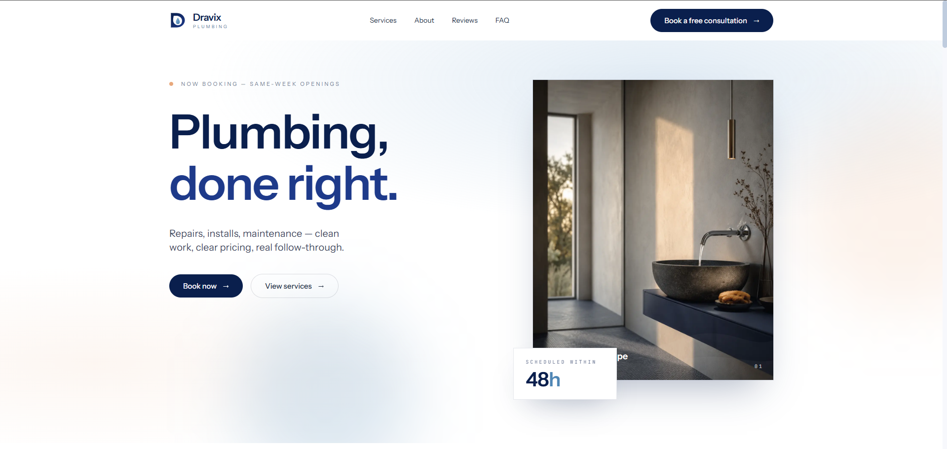
Most plumbing sites lean on red banners, sirens, and 24/7 badges. Dravix wanted to feel like the contractor a customer would actually invite into a quiet home. We built the hero around a single, slow image and a two-word headline, Plumbing, done right, and let the booking CTA carry the urgency.

The result reads more like a small architecture studio than a service business. Visitors who land from search find a calm room and a clear next step instead of a wall of guarantees.

We built the hero around a single, slow image and a two-word headline.

Chapter · 02

One CTA, everywhere

Every page on the site converges on the same action: Book a free consultation. The navigation carries it, the hero carries it, and the footer carries it. There is no secondary path: no quote form, no callback widget, no chat. One promise, one button.

The booking surface itself is a thin Calendly-style scheduler tied to Dravix's calendar, surfacing the next available 48-hour window automatically so customers see real availability instead of a generic contact form.

Chapter · 03

Trust, quietly assembled

Reviews and the FAQ live below the fold as quiet scaffolding. The reviews section pulls verbatim quotes set in the body face, no star ratings, no avatars, to match the editorial tone of the rest of the site. The FAQ is six questions, each answered in two sentences, written for the homeowner who's never hired a plumber before.

Together they do the work of the trust signals competitors plaster on their headers, without breaking the calm of the rest of the site.

Figures · A small visual index

3 plates

Services section listing repairs, drain cleaning, water heaters, and fixtures
Fig. 02Services: four offerings held to one standard.
FAQ accordion above a dark get-in-touch band with a single booking CTA
Fig. 03FAQ and contact: quiet answers, one consistent CTA.

Built mobile-first

How it feels in the hand.

Most visitors arrive on a phone, so that is where the design starts. Every screen is laid out for one thumb and a quick decision.

Hero: a two-word headline and a thumb-sized booking CTA.
01 / 03

Hero: a two-word headline and a thumb-sized booking CTA.

Outcome

Dravix launched into a soft market with a calm, conversion-first site that converts at roughly twice the rate of the prior template. Same-week bookings became the default rather than an occasional event, and the brand now reads, to homeowners and to commercial clients alike, as a step above the local field.

Filed under

PlumbingBookingBrand